The Design of Verdana
Primary Font
Verdana
In its proportions and stroke weight, the Verdana family resembles sans serifs such as Frutiger, and Johnston's typeface for the London Underground. But to label Verdana a humanist face is to ignore the successful fusion of form and function Carter has achieved. This isn't merely a revival of classical elegance and savoir faire; this is type designed for the medium of screen.
The Verdana fonts are stripped of features redundant when applied to the screen. They exhibit new characteristics, derived from the pixel rather than the pen, the brush or the chisel. The balance between straight, curve and diagonal has been meticulously tuned to ensure that the pixel patterns at small sizes are pleasing, clear and legible. Commonly confused characters, such as the lowercase i j l, the upercase I J L and the number 1, have been carefully drawn for maximum individuality - an important characteristic of fonts designed for on-screen use. And the various weights have been designed to create sufficient contrast from one another ensuring, for example, that the bold font is heavy enough even at sizes as small as 8 ppem.
Another reason for the legibility of these fonts on the screen is their generous width and spacing. At low resolutions, because of the limited number of pixels, letters cannot differ very much. But often the smallest differences can often change the whole look of a page, or a screenful of type; a fact demonstrated in the illustration below.
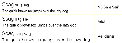
In the letters s a g - commonly critical, because they have more horizontal lines - there is not an appreciable difference between the fonts. While it is possible to prefer one of the 'a's to the others, the differences are only slight.
What makes the last 'quick brown fox' easier to read is the looser letterspacing. At eight points on the screen, the text in the other two fonts becomes too dark.
Despite the quality of the Verdana font family at small sizes it is at higher resolutions that they are best appreciated. In the words of Tom Rickner, "My hope now is that these faces will be enjoyed beyond just the computer screen. Although the screen size bitmaps were the most crucial in the production of these fonts...[their] uses should not be limited to on screen typography."
Home | Site Map |
Feedback |
About
© 2002 All Rights Reserved
NTRC