The basics features of HTML5 and CSS3 has been covered in "HTML5/CSS3 Basics". This articles covers the advanced features of HTML5/CSS3.
HTML5 Data-Attributes (data-*)
HTML5 data-* attributes provide a convenient way to store data in an HTML element. The stored data can be read or write using JavaScript. For example,
<div data-lines="content">......</div>
[TODO] more examples.
HTML5 Media Elements: <video> and <audio>
For example,
  <video controls width="600" height="480" poster="html5-logo.png">
    <source src="myVideo.mp4" type="video/mp4">
    Your browser does not support the video element.
  </video><br><br>

  <audio controls autoplay>
    <source src="myAudio.mp3" type="audio/mpeg">
    Your browser does not support the audio element.
  </audio><br><br>
Notes:
- To include subtitle for video:
<track kind="subtitles" src="hello.en.vtt" srclang="en" label="English">
- To include caption for audio:
<track kind="captions" src="hello.en.vtt" srclang="en" label="English">
- To autoplay in loop and muted (as background):
<video autoplay muted loop ...>
CSS Transform, Animation, and More
CSS transition Property
The CSS transition property specifies how to transit a property (such as color, height, etc.) into its target value. It has these 4 properties:
- transition-property: the CSS property (e.g.,
color,weight) to be transitioned, orallif all the transitionable properties need to be transitioned. - transition-duration: in second (
s) or millisecond (ms). - transition-timing-function: ease|ease-in|ease-out|ease-in-out|linear|cubic-bezier()|steps(): the function describes how the intermediate values during the transition are calculated.
- transition-delay: delay in second (
s) or millisecond (ms) before the transition starts. - (Shorthand) transition: property duration timing-function delay
Example 1:
<!DOCTYPE html>
<html lang="en">
<head>
  <meta charset="utf-8">
  <title>Test CSS "transition" Property</title>
  <style>
    .bg-transition {
      transition: background-color 5s; /* shorthand for: property duration */
    }
    div:hover {
      background-color: red;  /* apply transition from normal to this value */
    }
    div {
      background-color: lightgray;  /* normal state */
      width: 200px;
      height: 100px;
    }
  </style>
</head>
<body>
  <div class="bg-transition"></div>
</body>
</html>
When the mouse pointer hovers over the element, the background color transitions from normal state to the new value in 5 second.
Example 2
Three properties are transitioned in this example, with various durations and delays.
<!DOCTYPE html>
<html lang="en">
<head>
  <meta charset="utf-8">
  <title>Test CSS "transition" Property</title>
  <style>
    .transition {
      transition-property: height, width, background-color;
      transition-duration: 1s, 1s, 5s;
      transition-timing-function: linear;
      transition-delay: 0s, 1s, 0s;
    }
    .transition-all {
      transition: all 3s;  /* all transitionable properties */
    }
    div:hover {
      height: 200px;
      width: 200px;
      background-color: red;
    }
    div {
      background-color: lightgray;
      width: 100px;
      height: 100px;
      margin: 10px;
    }
  </style>
</head>
<body>
  <div class="transition"></div>
  <div class="transition-all"></div>
</body>
</html>
CSS animation Property with @keyframes
You can use @keyframes to define a set of keyframes, and use animation property to animate these keyframes. The animation properties include:
- animation-duration: duration in second (
s) or millisecond (ms) - animation-time-function:
- animation-delay: delay in second (
s) or millisecond (ms) before the animation begins. - animation-iteration-count: number|infinite:
- animation-direction:
- animation-fill-mode:
- animation-play-state:
- animation-name: name of the
@keyframes - (Shorthand) animation: duration timing-function delay iteration-count ... name
Example 1:
<!DOCTYPE html>
<html lang="en">
<head>
<meta charset="utf-8">
<title>Test "animation" Property</title>
<style>
@keyframes kf-rainbow-background {
  0%   { background-color: red; }
  20%  { background-color: orange; }
  40%  { background-color: yellow; }
  60%  { background-color: green; }
  80%  { background-color: blue; }
  100% { background-color: violet; }
}
.rainbow-background {
  animation: kf-rainbow-background 5s infinite;  /* name duration iteration-count */
}
div {
  width: 200px;
  height: 100px;
}
</style>
</head>
<body>
  <div class="rainbow-background"></div>
</body>
</html>
CSS 2D Transforms
- rotate(z): Rotates on z-axis byv the given angle.
- translateX(x)|translateY(y)|translate(x,y): translate (move) on x and/or y-axis.
- scaleX(x)|scaleY(y)|scale(x,y): scale (re-size) by the given multiples.
- skewX(x)|skewY(y)|skew(x,y): shear by the given angle.
- matrix(): define a 2D transformation matrix.
You can expressed angle in degrees (deg), gradians (grad), radians (rad) or turns (turn).
You can expressed length measurement in units such as px, or percent (%) which is relative to the width/height of the element under transformed.
Example 1: rotate(z)
<!DOCTYPE html>
<html lang="en">
<head>
  <meta charset="utf-8">
  <title>Test CSS 2D Transform</title>
  <style>
    .rotate {
      transform: rotate(-45deg);  /* negative value for counter clockwise */
    }
    div {
      background-color: lightblue;
      width: 200px;
      height: 40px;
    }
  </style>
</head>
<body>
  <div>Division 1</div>
  <div class="rotate">Division 2</div>
</body>
</html>
Observe that the transform (rotation) center is at the center of the element. You can use transform-origin to set the center of rotation, e.g.,
transform-origin: 100% 50%; /* center of right edge */
Example 2: translate(x, y)
Try:
transform: translateX(50%);
Observe that the percent measurement is relative to the width of the element.
Example 3: scale(x, y)
transform: scale(1.5, 0.5);
The transform center is default to the center of the element. Also, observe that the texts inside the division is scaled too.
Example 4: skew(x,y)
transform: skew(30deg, -20deg);
Observe that the texts inside the division is skewed too.
Example 5: Chained Transforms
transform: rotate(-45deg) translateX(-28px);
In chained transforms, the coordinate system moves with the element. This means that the translateX won't be horizontal but on an rotated axis. Changing the order of the rotation/translation will change the output.
Drawing a Circle using border-radius:50%
<!DOCTYPE html>
<html lang="en">
<head>
  <meta charset="utf-8">
  <title>Test Drawing Circle</title>
  <style>
    .circle {
      border-radius: 50%;
    }
    div {
      width:200px;
      height:200px;
      background-color: lightblue;
    }
  </style>
</head>
<body>
  <div class="circle"></div>
</body>
</html>
CSS Bouncing Ball via 2D transform
[TODO]
CSS 3D Transforms
- rotateX(x)|rotateY(y)|rotateZ(z)|rotate(x,y,z):
- translateX(x)|translateY(y)|translateZ(z)|translate(x,y,z):
- perspective:
Example 1: 3D Perspective
[TODO]
Example 2: 3D Cube
[TODO]
Example 3: 3D Bouncing Ball
[TODO]
CSS Image filter Functions
- blur(x): blur the image by
xpixels - brightness(x): adjust the brightness of the image. Values above 1.0 or 100% brighten the image; otherwise darken.
- contrast(x):
- greyscale(x): Show image in greyscale.
- invert(x):
- opacity(x):
- drop-shadow(h,v,x,y,z):
- hue-rotate(x)|saturate(x):
- more
You can also apply multiple filters in one operation like transform.
Example 1: blue(x)
.blur {
  filter: blur(3px);
}
Find an image to apply the above CSS style. Change the value and observe the resultant effects.
CSS Counter
counter-reset|counter-increment: counter-name: Reset and increment the particular counter.
Example 1: Add Section number to <h1>
<!DOCTYPE html>
<html lang="en">
<head>
  <meta charset="utf-8">
  <title>Test CSS Counter Property</title>
  <style>
    body {
      counter-reset: h1-counter;
    }
    h1 {
      counter-increment: h1-counter;
    }
    h1::before {
      content: "Section " counter(h1-counter) ". ";
    }
  </style>
</head>
<body>
  <h1>Aaaa</h1>
  <h1>Bbbb</h1>
  <h1>Cccc</h1>
</body>
</html>
We define a counter called h1-counter. We reset the counter in <body> and increment in <h1>. We then append the counter value before the <h1> via pseudo-element ::before.
Example 2: Multi-Level Nested Counters for <h1> and <h2>
<!DOCTYPE html>
<html lang="en">
<head>
  <meta charset="utf-8">
  <title>Test CSS Counter Property</title>
  <style>
    body {
      counter-reset: h1-counter;
    }
    h1 {
      counter-increment: h1-counter;
      counter-reset: h2-counter;
    }
    h2 {
      counter-increment: h2-counter;
    }
    h1::before {
      content: "Section " counter(h1-counter) ". ";
    }
    h2::before {
      content: counter(h1-counter) "." counter(h2-counter) " ";
    }
  </style>
</head>
<body>
  <h1>Aaaa</h1>
  <h2>Xxxx</h2>
  <h2>Yyyy</h2>
  <h1>Bbbb</h1>
  <h2>Xxxx</h2>
  <h1>Cccc</h1>
</body>
</html>
We define two counters: h1-counter and h2-counter, and reset/increment them accordingly.
CSS Functions
- calc(expr): accepts a mathematical expression (with
+,-,*,/operators) and returns a numerical value. - attr(name): returns the value of the attribute.
- var(name): returns the value of the variable. See "CSS Variables"
- linear-gradient(): creates a image representing a linear gradient of colors.
- radial-gradient(): create an image representing a gradient of colors radiating from the center of the gradient.
Example 1: linear-gradient and radial-gradient Functions
<!DOCTYPE html>
<html lang="en">
<head>
  <meta charset="utf-8">
  <title>Test CSS Gradient Property</title>
  <style>
    .linear-gradient {
       background-image: linear-gradient(90deg, red, yellow 50%, blue, green);
          /* 90deg: from left to right; 0deg: from bottom to top */
    }
    .radial-gradient {
       background-image: radial-gradient(violet, red, orange, yellow);
          /* from the center of element */
    }
    div {
      width:200px;
      height:100px;
    }
  </style>
</head>
<body>
  <div class="linear-gradient"></div>
  <div class="radial-gradient"></div>
</body>
</html>
CSS Column Layout
For example,
<!DOCTYPE html>
<html lang="en">
<head>
  <meta charset="utf-8">
  <title>Test Columns</title>
  <style>
    .multi-columns {
      column-count: 2;   /* or column-width:200px  */
      column-gap: 40px;
      column-rule: 3px solid gray;
    }
    div {
      background-color: lightblue;
    }
  </style>
</head>
<body>
  <div class="multi-columns">ipsum dolor sit amet, consectetur adipisicing elit, sed do eiusmod
  tempor incididunt ut labore et dolore magna aliqua. Ut enim ad minim veniam, quis nostrud
  exercitation ullamco laboris nisi ut aliquip ex ea commodo consequat. Duis aute irure dolor in
  reprehenderit in voluptate velit esse cillum dolore eu fugiat nulla pariatur. Excepteur sint
  occaecat cupidatat non proident, sunt in culpa qui officia deserunt mollit anim id est
  laborum</div>
</body>
</html>
Instead of using column-count to fix the number of columns, you can also use column-width to set the width of the column (say 200px) and leave the number of columns to be decided by the screen width.
HTML5 Canvas
References:
- MDC's Canvas Tutorial @ https://developer.mozilla.org/en/Canvas_tutorial.
- WHTAWG's Canvas API specification @ http://www.whatwg.org/specs/web-apps/current-work/multipage/the-canvas-element.html.
Before HTML5, drawing on the browser screen usually involves absolutely position and stretching an image using CSS or using plug-ins like flash. HTML5 provides a "Canvas API" for drawing primitives such as line, arc, rectangle, as well as supporting transformation, just like any 2D Graphics API. Canvas is supported in most of the modern browsers, such as Firefox, Chrome, and latest IE.
To use canvas API, first create a canvas element via the new <canvas></canvas> tag, e.g.,
<!DOCTYPE html>
<!-- H5CanvasTest.html -->
<html lang="en">

<head>
  <meta charset="utf-8">
  <title>Test HTML5 Canvas API</title>
  <style>
    #canvas {
      border: 1px solid red;
    }
  </style>
</head>

<body>
  <h2>Testing HTML5 Canvas</h2>
  <canvas id="canvas" height="200" width="300">Canvas is not supported</canvas>
</body>

</html>
How it Works?
- [TODO]
- The default width and height is 300 by 150 pixels.
Let's Draw Some Simple Shapes
The steps of using canvas are as follows:
- Create a canvas using the HTML5's new
<canvas id="canvas"></canvas>tag with a uniqueid. - Write a JavaScript:
- Use
canvas = document.getElementById("canvas")to select the canvas element. - Use
context = canvas.getContext("2d")to get the 2D drawing context. Currently, only 2D context is supported. - You can use the
contextto draw shapes and perform transformation.
- Use
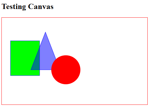
Example: Draw/Fill a Rectangle, a Triangle and a Circle
<!DOCTYPE html>
<!-- H5CanvasDrawPrimitives.html -->
<html lang="en">

<head>
  <meta charset="utf-8">
  <title>HTML5 Drawing Primitive Shapes</title>
  <style>
    #canvas {
      border: 1px solid red;
    }
  </style>

  <script>
    window.addEventListener("load", draw, true);

    function draw() {
      // Retrieve the canvas element and set its CSS style
      let canvas = document.getElementById("canvas");
      canvas.width = 500;
      canvas.height = 300;
      // Get the 2D drawing context for the canvas element
      let context = canvas.getContext("2d");

      // Draw a Rectangle using the rect primitive
      context.fillStyle = "rgb(0, 255, 0)";
      context.fillRect(30, 80, 100, 120);  // x, y, width, height
      context.strokeStyle = "#0000FF";
      context.strokeRect(30, 80, 100, 120);

      // Draw a triangle using path
      context.beginPath();
      context.moveTo(150, 50);
      context.lineTo(200, 180);
      context.lineTo(100, 180);
      context.closePath();
      context.fillStyle = "rgba(0, 0, 255, 0.5)";  // transparent
      context.fill();
      context.stroke();

      // Fill a circle using path
      context.beginPath();
      // centerX, centerY, radius, beginAngle, engAngle, antiClockwise
      context.arc(220, 180, 50, 0, Math.PI * 2, true);
      context.fillStyle = "red";
      context.fill();  // closePath() implicitly
    }
  </script>
</head>

<body>
  <h2>HTML5 Drawing Primitive Shapes</h2>
  <canvas id="canvas">Canvas is not supported</canvas>
</body>

</html>
How it Works?
[TODO]
To check if canvas is supported, you could use the following script:
let canvas = document.getElementById("canvasID");
if (canvas.getContext){
  let context = canvas.getContext("2d");
  // drawing codes here
} else {
  // canvas-unsupported codes here
}
Draw/Fill Primitive Shapes
- Coordinate System: The origin (0, 0) is at the top-left corner, with x-axis pointing to the right and y-axis pointing downward. This is consistent with most 2D graphics system.
- Color and Style:
attribute any strokeStyle; // default black
attribute any fillStyle;   // default black
Color can be specified via "#rrggbb" (from "#000000" to "#FFFFFF"), "rgb(r, g, b)", "rgba(r, g, b, a)" (where0≤r,g,b≤255and0≤a≤1specifies the transparency), or CSS color literals (such as "red", "green", "blue"). - Rectangle: The canvas API supports only one primitive shape - rectangle. All the other shapes are formed using path.
void clearRect(double topLeftX, double topLeftY, double width, double height);
  // Clear the rectangular area, i.e., set to transparent.
void fillRect(double topLeftX, double topLeftY, double width, double height);
  // Fill the rectangular area with fillStyle.
void strokeRect(double topLeftX, double topLeftY, double width, double height);
  // Draw the outline of the rectangle, with strokeStyle.
- Path: These steps are need to render using path:
- Call the
beginPath()to start a path, which may contain many sub-paths (such as line, arc). ThebeginPath()resets (clears) the sub-path list. - Define a path using
rect(),arc(), orxxxTo(). - Optionally call the
closePath()to form a close loop, i.e., join the last point to the first point with a straight line. - Invoke
fill()and/orstroke()to fill the path or render the outline. Iffill()is used, the open shape will be closed and there is no need toclosePath().
void beginPath();
  // Start a path, clear the sub-path list
void closePath();
  // Join the last point and the first point with a straight line.

void moveTo(double x, double y);
  // Position without joining with previous point.

void lineTo(double x, double y);
void arcTo(double x1, double y1, double x2, double y2, double radius);
void quadraticCurveTo(double cpx, double cpy, double x, double y);
void bezierCurveTo(double cp1x, double cp1y, double cp2x, double cp2y, double x, double y);
void rect(double x, double y, double w, double h);
void arc(double x, double y, double radius, double startAngle, double endAngle, optional boolean anticlockwise);
  // various Path: line, arc, curves, shape

void fill();    // Fill the shape enclosed by the path
void stroke();  // Draw the outline
- Call the
Transformation
The commonly-used JavaScript functions for transformation are:
void save();     // push state on state stack
void restore();  // pop state stack and restore state

void translate(double x, double y);
void rotate(double angle);
void scale(double x, double y);
void transform(double m11, double m12, double m21, double m22, double dx, double dy);
void setTransform(double m11, double m12, double m21, double m22, double dx, double dy);
The default transform is the identity matrix.
Example
<!DOCTYPE html>
<!-- H5CanvasTransform.html -->
<html lang="en">

<head>
  <meta charset="utf-8">
  <title>HTML5 Transformation</title>
  <style>
    #canvas {
      border: 1px solid red;
    }
  </style>

  <script>
    window.addEventListener("load", draw, true);

    function draw() {
      // Retrieve the canvas element and set its CSS style
      let canvas = document.getElementById("canvas");
      canvas.width = 300;
      canvas.height = 200;
      // Get the 2D drawing context for the canvas element
      let context = canvas.getContext("2d");

      context.save();  // save the state
      context.translate(100, 50);
      fillTriangle(context);  // default styles;

      context.translate(120, 25);
      fillTriangle(context);
      let i;
      for (i = 0; i < 8; i++) {
        context.rotate(Math.PI / 6);
        context.fillStyle = "rgba(0, " + (i * 25) + ", 0, 0.5)";
        fillTriangle(context);
      }

      context.restore();  // restore the saved state
      context.scale(1.5, 1.5);
      fillTriangle(context);
    }

    function fillTriangle(context) {
      context.beginPath();
      context.moveTo(0, 0);
      context.lineTo(50, 0);
      context.lineTo(25, 50);
      context.fill();
    }
  </script>
</head>

<body>
  <h2>HTML5 Transformation</h2>
  <canvas id="canvas">Canvas is not supported</canvas>
</body>

</html>
How It Works?
- We usually invoke
save()to push the state of the canvas onto the stack. The state includes all the transforms applied so far, the styles and the clipping path. We can restore the state viarestore(), which pops the saved state from the stack. Translate(),rotate()andscale()are referenced to the current origin, after the latest transform. Rotation is anti-clockwise measured in radian.- The function
transform(m11, m12, m21, m22, dx, dy)multiplies the current transform by the given transformation matrix:m11 m12 dx m21 m22 dy 0 0 1
where(m11, m12, m21, m22)represents the rotation and(dx, dy)represents translation.
ThesetTransform(m11, m12, m21, m22, dx, dy)set the transform to the given matrix, i.e., it resets the current transform to identity and then apply thetransform()function.
Using Images
To draw an image on the canvas: Find a reference to an image object or other canvas object as a source, and invoke drawImage() function.
You can construct an image reference and draw the image onto the canvas as follows:
let myImg = new Image();      // Create a new <img> element
myImg.src = "imageFilename";  // Set source path
myImg.onload = function() {   // Wait till the image is loaded
  // Do drawImage here
  drawImage(myImg, 0, 0);
  ......
};
You can also get an image reference via document.images property, or functions document.getElementsByTagName("img"), document.getElementById("imageID").
Example:
[TODO]
void drawImage(HTMLImageElement image, double x, double y);
  // Draw the image with top-left corner at x and y.
void drawImage(HTMLImageElement image, double x, double y, double width, double height);
  // Draw and scale the image to the specified width and height.
void drawImage(HTMLImageElement image, double srcX, double srcY, double srcWidth, double srcHeight,
               double destX, double destY, double destWidth, double destHeight);
  // Slice part of the source image and draw to the destination.

void drawImage(HTMLCanvasElement image, double dx, double dy);
void drawImage(HTMLCanvasElement image, double dx, double dy, double dw, double dh);
void drawImage(HTMLCanvasElement image, double double srcX, double srcY, double srcWidth, double srcHeight,
               double destX, double destY, double destWidth, double destHeight);

void drawImage(HTMLVideoElement image, double dx, double dy);
void drawImage(HTMLVideoElement image, double dx, double dy, double dw, double dh);
void drawImage(HTMLVideoElement image, double srcX, double srcY, double srcWidth, double srcHeight,
               double destX, double destY, double destWidth, double destHeight);
Styles
// line caps/joins
attribute double lineWidth;   // (default 1)
attribute DOMString lineCap;  // "butt", "round", "square" (default "butt")
attribute DOMString lineJoin; // "round", "bevel", "miter" (default "miter")
attribute double miterLimit;  // (default 10)
Animation
Read "HTML5 Bouncing Ball".
The steps are:
- Clear the canvas: via
fillRect(). - Save the canvas state.
- Draw the shape.
- Restore the canvas state.
You can use the following functions to control the timing:
setInterval():setTimeout(): run once after the set timing expires.
Canvas API DOM Interface
interface HTMLCanvasElement : HTMLElement {
  attribute unsigned long width;
  attribute unsigned long height;

  DOMString toDataURL(optional DOMString type, any... args);
  void toBlob(FileCallback? callback, optional DOMString type, any... args);

  object? getContext(DOMString contextId, any... args);
};

interface CanvasRenderingContext2D {
  // back-reference to the canvas
  readonly attribute HTMLCanvasElement canvas;

  // state
  void save(); // push state on state stack
  void restore(); // pop state stack and restore state

  // transformations (default transform is the identity matrix)
  void scale(double x, double y);
  void rotate(double angle);
  void translate(double x, double y);
  void transform(double a, double b, double c, double d, double e, double f);
  void setTransform(double a, double b, double c, double d, double e, double f);

  // compositing
  attribute double globalAlpha; // (default 1.0)
  attribute DOMString globalCompositeOperation; // (default source-over)

  // colors and styles
  attribute any strokeStyle; // (default black)
  attribute any fillStyle; // (default black)
  CanvasGradient createLinearGradient(double x0, double y0, double x1, double y1);
  CanvasGradient createRadialGradient(double x0, double y0, double r0, double x1, double y1, double r1);
  CanvasPattern createPattern(HTMLImageElement image, DOMString repetition);
  CanvasPattern createPattern(HTMLCanvasElement image, DOMString repetition);
  CanvasPattern createPattern(HTMLVideoElement image, DOMString repetition);

  // line caps/joins
  attribute double lineWidth; // (default 1)
  attribute DOMString lineCap; // "butt", "round", "square" (default "butt")
  attribute DOMString lineJoin; // "round", "bevel", "miter" (default "miter")
  attribute double miterLimit; // (default 10)

  // shadows
  attribute double shadowOffsetX; // (default 0)
  attribute double shadowOffsetY; // (default 0)
  attribute double shadowBlur; // (default 0)
  attribute DOMString shadowColor; // (default transparent black)

  // rects
  void clearRect(double x, double y, double w, double h);
  void fillRect(double x, double y, double w, double h);
  void strokeRect(double x, double y, double w, double h);

  // path API
  void beginPath();
  void closePath();
  void moveTo(double x, double y);
  void lineTo(double x, double y);
  void quadraticCurveTo(double cpx, double cpy, double x, double y);
  void bezierCurveTo(double cp1x, double cp1y, double cp2x, double cp2y, double x, double y);
  void arcTo(double x1, double y1, double x2, double y2, double radius);
  void rect(double x, double y, double w, double h);
  void arc(double x, double y, double radius, double startAngle, double endAngle, optional boolean anticlockwise);
  void fill();
  void stroke();
  void drawSystemFocusRing(Element element);
  boolean drawCustomFocusRing(Element element);
  void scrollPathIntoView();
  void clip();
  boolean isPointInPath(double x, double y);

  // text
  attribute DOMString font; // (default 10px sans-serif)
  attribute DOMString textAlign; // "start", "end", "left", "right", "center" (default: "start")
  attribute DOMString textBaseline; // "top", "hanging", "middle", "alphabetic", "ideographic", "bottom" (default: "alphabetic")
  void fillText(DOMString text, double x, double y, optional double maxWidth);
  void strokeText(DOMString text, double x, double y, optional double maxWidth);
  TextMetrics measureText(DOMString text);

  // drawing images
  void drawImage(HTMLImageElement image, double dx, double dy);
  void drawImage(HTMLImageElement image, double dx, double dy, double dw, double dh);
  void drawImage(HTMLImageElement image, double sx, double sy, double sw, double sh, double dx, double dy, double dw, double dh);
  void drawImage(HTMLCanvasElement image, double dx, double dy);
  void drawImage(HTMLCanvasElement image, double dx, double dy, double dw, double dh);
  void drawImage(HTMLCanvasElement image, double sx, double sy, double sw, double sh, double dx, double dy, double dw, double dh);
  void drawImage(HTMLVideoElement image, double dx, double dy);
  void drawImage(HTMLVideoElement image, double dx, double dy, double dw, double dh);
  void drawImage(HTMLVideoElement image, double sx, double sy, double sw, double sh, double dx, double dy, double dw, double dh);

  // pixel manipulation
  ImageData createImageData(double sw, double sh);
  ImageData createImageData(ImageData imagedata);
  ImageData getImageData(double sx, double sy, double sw, double sh);
  void putImageData(ImageData imagedata, double dx, double dy);
  void putImageData(ImageData imagedata, double dx, double dy, double dirtyX, double dirtyY, double dirtyWidth, double dirtyHeight);
};

interface CanvasGradient {
  // opaque object
  void addColorStop(double offset, DOMString color);
};

interface CanvasPattern {
  // opaque object
};

interface TextMetrics {
  readonly attribute double width;
};

interface ImageData {
  readonly attribute unsigned long width;
  readonly attribute unsigned long height;
  readonly attribute Uint8ClampedArray data;
};
Link To JavaScript/jQuery References & Resources